

Problem
Access barriers in lattice design for mechanical engineers

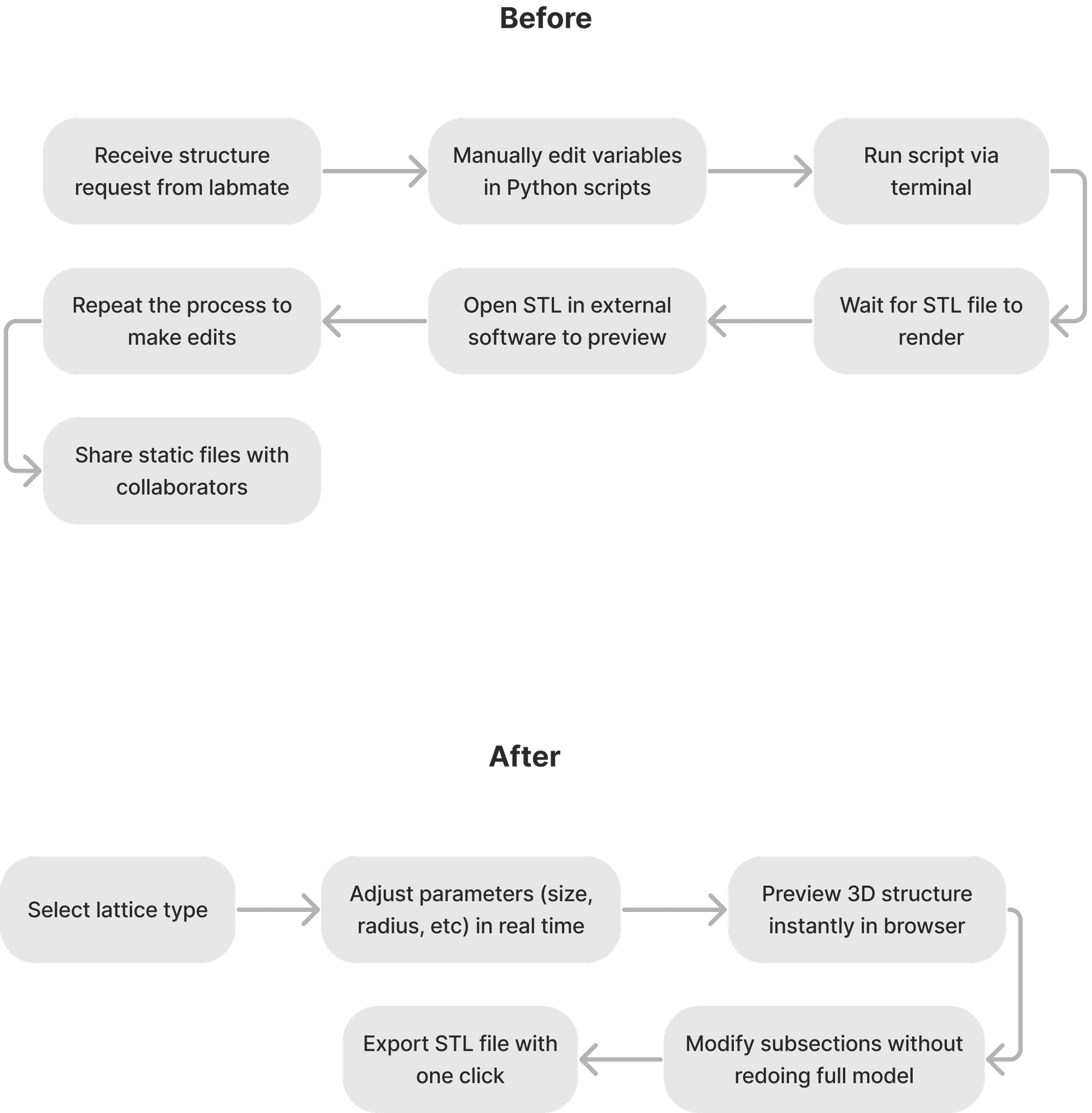
And through user interviews with the research team, I learned that the current workflow is slow, rigid, and difficult to iterate on:
Low flexibility
Small design changes often require rebuilding the entire lattice structure.
No preview
Code tool takes long output times, no real-time feedback
Complex connectivity
Static Lattice picture is difficult to visualize how unit cells connect in 3D space.
Not Modular
No way to reuse, swap, or edit parts without rewriting large portions of code.
Design Solution 1
Redesigning workflow for low-code accessibility
In collaboration with my supervisor/backend engineer Molly, I explored what was technically feasible to change or add. Based on those constraints, I redesigned the workflow to be more accessible, intuitive, and low-code—supporting modular editing, real-time feedback, and 3D preview.

Design Solution 2
Solving iteration pain with 3D feedback and customizable parameters
I designed customizable lattice parameters with a real-time 3D preview to help users test designs quickly and understand curve connections.
To implement this at front end, I chose Plotly for its interactive 3D support and ease of development, balancing user needs with engineering constraints to deliver a tool that’s both intuitive and efficient.
Design Solution 3
Advanced modular control for more flexible lattice editing and clearer preview
I designed the Advanced Settings panel to support double networks and subsection-specific controls. Users needed more flexibility to test and swap parts of a lattice without restarting from scratch.
By making the system modular, I enabled faster experimentation—a key step in designing new lattice materials.
Design Solution 4
Tailoring Export Options to User Workflows
Based on user feedback during testing with the research team, we added a dedicated STL saving function to support structure simulation, collaboration, and 3D printing.
I separated saving into CSV export for data analysis and STL export for fabrication and sharing, aligning output formats with users’ specific workflow needs.
Impact
Increased design efficiency, fewer errors, more users
Design Efficiency
+50%
Error Rate
-67%
User Adoption Rate
+83%
Brand Identity and Design System
Bringing MIT Identity Into the UI
I used MIT Department of Mechanical Engineering’s brand colors to reflect the research context while keeping the interface clean and professional.
Inspired by tools like Photoshop, the dark theme helps users focus on the 3D preview. Color-coded curves make structures easier to read and compare during design.
